FINALIST nominated in the category for
“BEST REAL ESTATE LOGO DESIGNS”
by the
![]()

FINALIST nominated in the category for
“BEST REAL ESTATE LOGO DESIGNS”
by the
![]()
Ready to branch out and grow her real estate business, Laurence needed a logo that was sophisticated, yet simple.
Using a handwritten typeface style for her name added a lovely, personal feeling while remaining easy to read. The icon represents a home or homes moving, growing, changing (for obvious reasons) and the modern serif used for the title adds just the right professional touch.
This is a logo that perfectly represents the woman behind it.

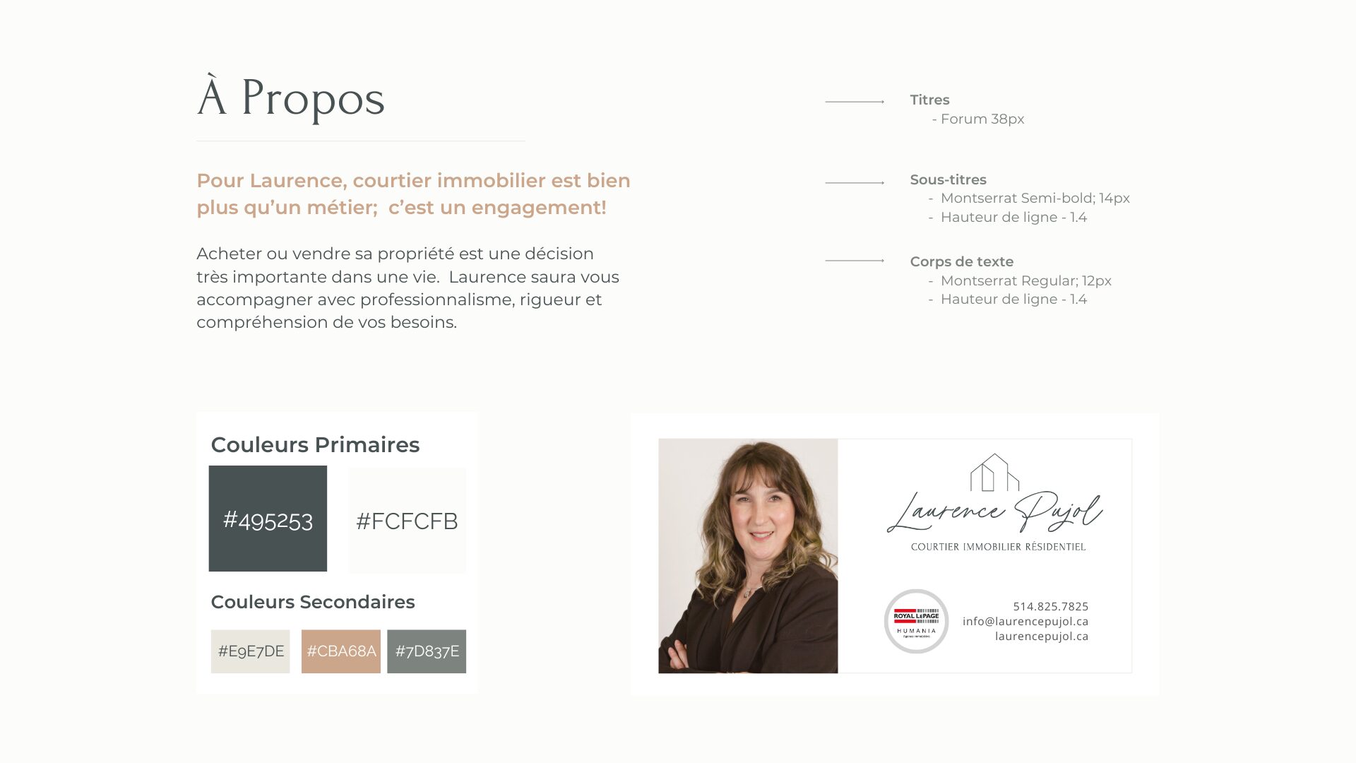
Charcoal Grey
Khaki Grey
Oatmeal
Creamy White
Salted Caramel
The colour palette is a combination of sophisticated cool & warm neutrals. The neutral tones provide a soft, inviting backdrop allowing the home images to shine & clients to feel comfortable & at ease.
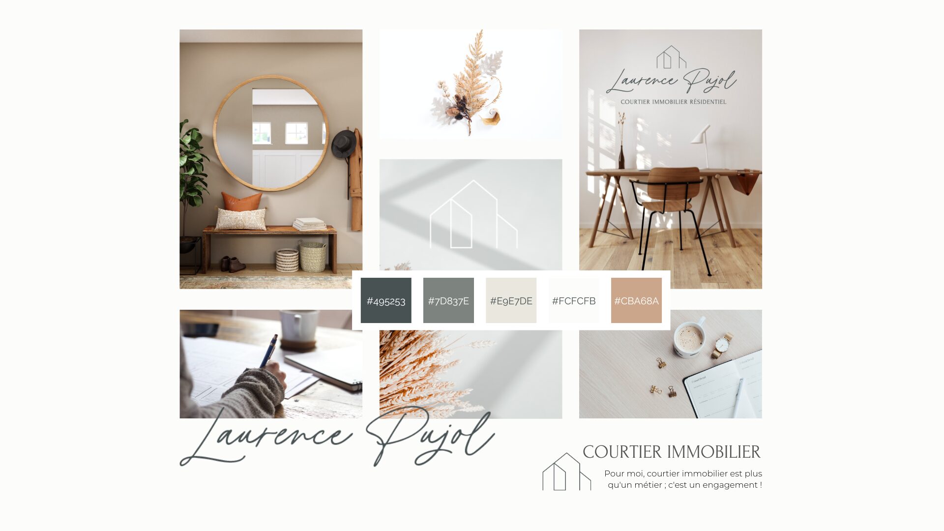
Branded images created for social media.


