To celebrate their 15th year in business ABEL design needed to honour the achievement with a whole new visual identity including an updated logo, website, and social media presence. I am thrilled to collaborate with them and help guide the evolution of their visual communications and digital marketing.
ABEL design is the combined mission of Alain Beauchesne, draftsman; and Emmanuelle Landry, interior designer. It’s also a team of incredible professionals who complete KITCHENS & BATHROOMS projects and much more.
ABEL design studies spaces in order to find functional and aesthetic solutions, while respecting the clients needs. Their principal mandate is to provide a wide range of products and materials for all your home renovation & building projects.
Located in the heart of the Laurentians and serving the provinces of Quebec and New Brunswick, they can’t wait to hear about your renovation or new build needs. Contact ABEL design to learn more.
ABEL design is celebrating a milestone year in business and needed to honor the achievement with a whole new visual identity including an updated logo, website, and social media presence. I am thrilled to collaborate with them and help guide the evolution of their visual communications and digital marketing.
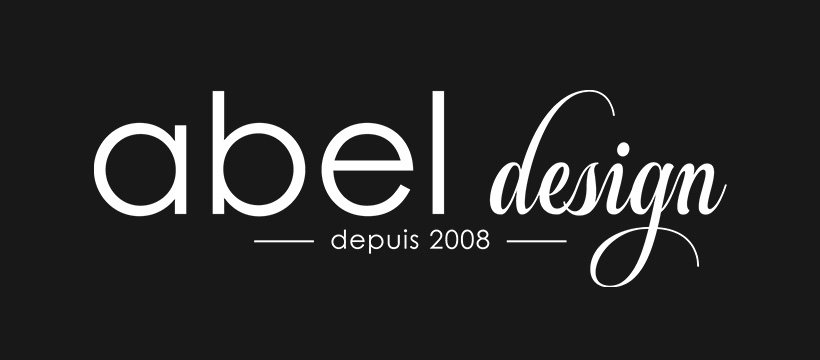
The original logo included ‘cuisine’ (kitchen) and ‘salle de bain’ (bathroom) which are the two areas of expertise for ABEL design and no longer necessary to feature. The original featured a red, white, & black palette which was bold & energetic but sometimes in contrast or distracting from the portfolio images themselves. They loved the contrasting typeface style for the two words but were open to change. They also wanted to showcase that they have been in business since 2008!

The new logo maintained the orginal typeface used for ‘abel’ but elevated the script typeface used for ‘design’ to one that felt more modern and sophisticated. A single colour (white OR soft black) was adapted to increase readablity when used on more complicated backgrounds and allow the focus to be on the service & portfolio images. The subtitle ‘depuis 2008’ (since 2008) was added as a timeless reference for how long they have been in business & allowing the new version limitless longevity.


Almost Black
Phthalo Green
Evergreen
Leafy Green
Acadian Sand
Luminous Grey
The new colour palette is a combination of sophisticated neutrals and greens. Inspired by the Laurentian landscape and a wink at the owner’s acadian roots. The neutral tones maintain an elegant backdrop that allows for the projects to shine and be fully visible without distraction.

Branded images created for social media.